
概要
機械学習の PR 曲線、ROC 曲線、AUC について解説します。
PR 曲線
クラスが正例 (positive)、負例 (negative) である2クラス分類問題を考えます。 例えば、線形モデルで分類する場合、決定関数 (decision function) $f(\boldsymbol{x})$ の値が閾値 $t$ 以下かどうかで予測ラベルを決めるようになっています。
$$ \begin{aligned} \text{predict}(\boldsymbol{x}) = \begin{cases} \text{negative} & ( f(\boldsymbol{x}) \le t ) \\ \text{positive} & ( f(\boldsymbol{x}) > t ) \end{cases} \end{aligned} $$ここで、適合率 (precision) と再現率 (recall) の定義は次のようになっています。
$$ \text{precision} = \frac{TP}{TP + FP} $$$$ \text{recall} = \frac{TP}{TP + FN} $$閾値 $t$ を大きくすると、positive と予測する基準が厳しくなり、偽陽性 (FP) が減るので、適合率は上がります。一方、positive であるものも negative と間違える数が増えるので、偽陰性 (FN) が大きくなり、再現率が下がります。
import matplotlib.pyplot as plt
import numpy as np
from sklearn.datasets import make_blobs
from sklearn.linear_model import SGDClassifier

# データセットを作成する。
X, y = make_blobs(n_samples=100, centers=2, random_state=0)

# 学習する。
clf = SGDClassifier(random_state=0).fit(X, y)


def draw_decision_boundary(ax, clf, X, y, threshold):
    # データセットを描画する。
    scatter = ax.scatter(X[:, 0], X[:, 1], c=y, s=20, cmap="Paired")
    handles, labels = scatter.legend_elements()
    ax.legend(handles, ["negative", "positive"], title="Classes")

    # 決定境界を描画する。
    ## 格子状の点を作成する。
    X, Y = np.meshgrid(
        np.linspace(*ax.get_xlim(), 1000), np.linspace(*ax.get_ylim(), 1000)
    )
    XY = np.column_stack([X.ravel(), Y.ravel()])

    ## 各点が属するクラスタを計算する。
    scores = clf.decision_function(XY)
    labels = np.where(scores <= threshold, 0, 1)
    Z = labels.reshape(X.shape)

    ## 等高線を描画する。
    ax.contourf(X, Y, Z, alpha=0.3, cmap="jet")

    ax.set_title(f"threshold = {threshold:.1f}")


# 描画する。
fig = plt.figure(figsize=(16, 8), facecolor="w")

# 閾値
params = [-150, -100, 0, 100, 150]

for i, p in enumerate(params, 1):
    ax = fig.add_subplot(2, 3, i)
    draw_decision_boundary(ax, clf, X, y, threshold=p)

plt.show()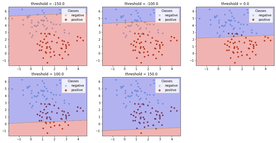
この閾値を変えた場合に適合率、再現率がどうかわるかを計算します。
import matplotlib.pyplot as plt
import numpy as np
from sklearn.datasets import make_blobs
from sklearn.linear_model import SGDClassifier
from sklearn.metrics import precision_recall_curve

# データセットを作成する。
X, y = make_blobs(n_samples=1000, centers=2, random_state=0)

# 学習する。
clf = SGDClassifier(random_state=0).fit(X, y)
y_score = clf.decision_function(X)

# 各閾値での適合率、再現率を計算する。
precision, recall, threshold = precision_recall_curve(y, y_score)

# 描画する。
fig, ax = plt.subplots(facecolor="w")
ax.set_xlabel("Threshold")
ax.grid()

ax.plot(threshold, precision[:-1], label="Precision")
ax.plot(threshold, recall[:-1], label="Recall")
ax.legend()

plt.show()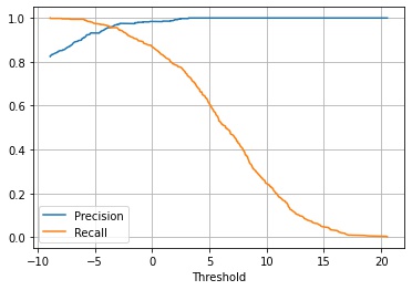
この2つのグラフを同じ閾値で対応付けて、x 軸に適合度 (precision)、y 軸に再現率 (recall) をとって描画したグラフをPR 曲線 (precision recall curve) といいます。
fig, ax = plt.subplots(facecolor="w", figsize=(5, 5))
ax.grid()

ax.plot(precision, recall)
ax.set_xlabel("Precision")
ax.set_ylabel("Recall")

plt.show()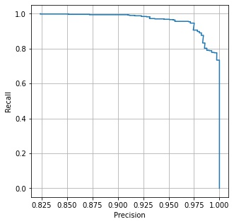
ROC 曲線
偽陽性率 (False Positive Rate, FPR) と真陽性率 (True Positive Rate, TPR) の定義は次のようになっています。
$$ \displaystyle FPR = \frac{FP}{TN + FP} $$$$ \displaystyle TPR = \frac{TP}{TP + FN} $$閾値を変えた場合に偽陽性率、真陽性率がどうかわるかを計算します。
import matplotlib.pyplot as plt
import numpy as np
from sklearn.datasets import make_blobs
from sklearn.linear_model import SGDClassifier
from sklearn.metrics import roc_curve

# データセットを作成する。
X, y = make_blobs(n_samples=1000, centers=2, random_state=0)

# 学習する。
clf = SGDClassifier(random_state=0).fit(X, y)
y_score = clf.decision_function(X)


# 各閾値での偽陽性、真陽性率を計算する。
fpr, tpr, thresholds = roc_curve(y, y_score)

# 描画する。
fig, ax = plt.subplots(facecolor="w", figsize=(8, 6))
ax.set_xlabel("Threshold")
ax.grid()

ax.plot(thresholds, fpr, label="FPR")
ax.plot(thresholds, tpr, label="TPR")
ax.legend()

plt.show()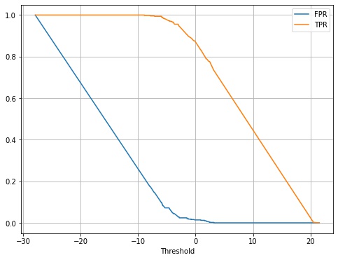
この2つのグラフを同じ閾値で対応付けて、x 軸に偽陽性率、y 軸に真陽性率をとって描画したグラフを ROC 曲線 (receiver operationg characteristic) といいます。
fig, ax = plt.subplots(facecolor="w", figsize=(5, 5))
ax.grid()

ax.plot(fpr, tpr)
ax.set_xlabel("FPR")
ax.set_ylabel("TPR")

plt.show()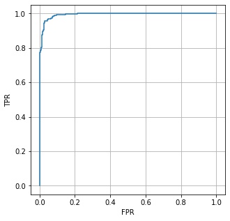
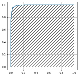
AUI
ROC 曲線の内側の部分の面積を AUC (area under curve) といいます。
import matplotlib.pyplot as plt
import numpy as np
from sklearn.datasets import make_blobs
from sklearn.linear_model import SGDClassifier
from sklearn.metrics import roc_curve, auc

# データセットを作成する。
X, y = make_blobs(n_samples=1000, centers=2, random_state=0)

# 学習する。
clf = SGDClassifier(random_state=0).fit(X, y)
y_score = clf.decision_function(X)

# 各閾値での偽陽性、真陽性率を計算する。
fpr, tpr, thresholds = roc_curve(y, y_score)

# AUCを計算する。
print(auc(fpr, tpr))  # 0.99334
0.99334
コメント