
目次
概要
matplotlib で scikit-learn で学習したモデルの決定境界を可視化する方法について解説します。
1. 学習する
iris データセットを使用します。特徴量としては、Sepal Length、Sepal Width、Petal Length、Petal Width の4つのうち、Sepal Length、Petal Length の2変数を使用します。モデルはロジスティック回帰モデルを使用します。
In [1]:
import matplotlib.pyplot as plt
import numpy as np
from sklearn import datasets
from sklearn.linear_model import LogisticRegression
from sklearn.model_selection import train_test_split

# データを取得
iris = datasets.load_iris()
data = iris.data[:, [0, 2]]
label = iris.target

# 学習データとテストデータに分割する。
X_train, X_test, y_train, y_test = train_test_split(
    data, label, test_size=0.2, stratify=label, random_state=0
)

# ロジスティック回帰モデルで学習する。
model = LogisticRegression(solver="lbfgs", multi_class="multinomial")
model.fit(X_train, y_train)

# テストデータを推論し、精度を出力する。
y_pred = model.score(X_test, y_test)
print(f"test accuracy: {y_pred:.2%}")
test accuracy: 100.00%
2. 決定境界を描画する
以下のモデルの決定境界を描画するためのコードについて解説します。
In [2]:
fig, ax = plt.subplots(figsize=(8, 6))

# タイトル、x 軸、y 軸のラベルを設定する。
ax.set_title("classification data using LogisticRegression")
ax.set_xlabel("Sepal length")
ax.set_ylabel("Petal length")

# サンプルを描画する。
ax.scatter(data[:, 0], data[:, 1], c=label, s=7, cmap="tab10")

# 推論する。
X, Y = np.meshgrid(np.linspace(*ax.get_xlim(), 1000), np.linspace(*ax.get_ylim(), 1000))
XY = np.column_stack([X.ravel(), Y.ravel()])
Z = model.predict(XY).reshape(X.shape)

# 等高線を描画する。
ax.contourf(X, Y, Z, alpha=0.4, cmap='Paired')
plt.show()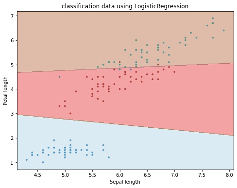
1. サンプルを描画する
Axes.scatter() でサンプルを描画します。
fig, ax = plt.subplots(figsize=(8, 6))

# タイトル、x 軸、y 軸のラベルを設定する。
ax.set_title("classification data using LogisticRegression")
ax.set_xlabel("Sepal length")
ax.set_ylabel("Petal length")

# サンプルを描画する。
ax.scatter(data[:, 0], data[:, 1], c=label, s=7, cmap="tab10")
2. サンプルの描画範囲の各点の予測ラベルを計算する
サンプルの描画範囲の各点の予測ラベルを以下の手順で計算しあmす。
- グラフの x 軸、y 軸の描画範囲をそれぞれ
Axes.get_xlim()、Axes.get_ylim()で取得し、この範囲に格子状に点を numpy.meshgrid() で作成します。 - 作成した各点をモデルで推論し、その点のラベルを取得します。
LogisticRegression.predict()の引数は (サンプル数, 特徴量の次元数) という2次元配列を想定しているため、形状を変更してから、推論します。 - 推論結果は、X, Y と同じ形状に戻します。
print("xlim", ax.get_xlim())  # xlim (4.116740225759217, 8.083259774240783)
print("ylim", ax.get_ylim())  # ylim (0.7005384988315995, 7.199461501168401)
X, Y = np.meshgrid(np.linspace(*ax.get_xlim(), 1000), np.linspace(*ax.get_ylim(), 1000))

# 推論する。
# 1. X.ravel(): (N, M) -> (N * M,)
# 2. Y.ravel(): (N, M) -> (N * M,)
# 3. numpy.column_stack(): ((N * M,), (N * M,)) -> (N * M, 2)
# 4. predict(XY).reshape(X.shape): (N * M,) -> (N, M)
XY = np.column_stack([X.ravel(), Y.ravel()])
Z = model.predict(XY).reshape(X.shape)
3. 等高線を描画する
2でサンプル (x, y) とその推論ラベル z のデータを作成することができました。これは次のような関数と考えることができます。
この関数を上から見た図、つまり等高線を考えるとこれが分類境界になります。
# 等高線を描画する。
ax.contourf(X, Y, Z, alpha=0.4, cmap='Paired')
plt.show()
コメント