
目次
概要
matplotlib で図に表 (テーブル) を付加する方法について紹介します。
API
- pyplot.table: テーブルを作成する
- Axes.table: テーブルを作成する
使い方
table(cellText=None, cellColours=None,
      cellLoc='right', colWidths=None,
      rowLabels=None, rowColours=None, rowLoc='left',
      colLabels=None, colColours=None, colLoc='center',
loc='bottom', bbox=None)- cellText: 各セルの値を表す形状が (rows, cols) の2次元配列。
- cellColours: 各セルの背景色
- cellLoc: 各セルのアラインメント
- colWidths: 各列の幅
- rowLabels: 各行のヘッダーのラベル
- rowColours: 各行のヘッダーの背景色
- rowLoc: 各行のヘッダーラベルのアラインメント
- colLabels: 各列のヘッダーのラベル
- colColours: 各列のヘッダーの背景色
- colLoc: 各列のヘッダーラベルのアラインメント
- loc: テーブルを Axes に結合する位置
- bbox: テーブルの位置を決める際の座標系の bounding box
使い方
データを用意する
以下のようなテーブルデータを用意します。
In [1]:
import matplotlib.pyplot as plt
import numpy as np
import pandas as pd

data = np.array(
    [
        [66386, 174296, 75131, 577908, 32015],
        [58230, 381139, 78045, 99308, 160454],
        [89135, 80552, 152558, 497981, 603535],
        [78415, 81858, 150656, 193263, 69638],
        [139361, 331509, 343164, 781380, 52269],
    ]
)
columns = ["Freeze", "Wind", "Flood", "Quake", "Hail"]
rows = ["%d year" % x for x in [5, 10, 20, 50, 100]]

df = pd.DataFrame(data, index=rows, columns=columns)
num_rows, num_cols = len(rows), len(columns)| Freeze | Wind | Flood | Quake | Hail | |
|---|---|---|---|---|---|
| 5 year | 66386 | 174296 | 75131 | 577908 | 32015 |
| 10 year | 58230 | 381139 | 78045 | 99308 | 160454 |
| 20 year | 89135 | 80552 | 152558 | 497981 | 603535 |
| 50 year | 78415 | 81858 | 150656 | 193263 | 69638 |
| 100 year | 139361 | 331509 | 343164 | 781380 | 52269 |
積み上げ棒グラフを作成する
In [2]:
# 色を生成する。
colors = plt.cm.BuPu(np.linspace(0, 0.5, num_rows))

fig, ax = plt.subplots(figsize=(8, 8))

# 積み上げ棒グラフを作成する。
xs = np.arange(num_cols) + 0.3  # 棒グラフの起点の x 座標
offset = np.zeros(num_rows)  # 棒グラフの起点の y 座標
for i in range(num_rows):
    ax.bar(xs, df.iloc[i], width=0.4, bottom=offset, color=colors[i])
    offset += df.iloc[i]

# 積み上げ棒グラフは下から上、テーブルは上から下に設定するので反転させる。
colors = colors[::-1]
df = df.iloc[::-1]
# 累積和
cells = df.cumsum(axis=0).applymap(lambda x: f"{x / 1000:.1f}")
# テーブルを作成する。
ax.table(
    cellText=df.values, rowLabels=df.index, rowColours=colors, colLabels=df.columns, loc="bottom"
)

# 軸及びラベルを設定する。
ax.set_xticks([])
ax.set_ylabel("Loss")
ax.set_title("Loss by Disaster")

plt.show()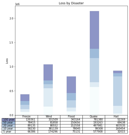
コメント