
目次
概要
matplotlib で棒グラフを作成する方法について解説します。
公式リファレンス
- API リファレンス
- pyplot.bar: 垂直方向に棒グラフを作成する。
- axes.Axes.bar: 垂直方向に棒グラフを作成する。
- pyplot.barh: 水平方向に棒グラフを作成する。
- axes.Axes.barh: 水平方向に棒グラフを作成する。
- pyplot.broken_barh: 水平方向に連続した長方形を作成する。
- axes.Axes.broken_barh: 水平方向に連続した長方形を作成する。
- サンプル
pyplot.bar
matplotlib.pyplot.bar(x, height, width=0.8, bottom=None, *, align='center', data=None, **kwargs)引数
| 名前 | 型 | デフォルト値 |
|---|---|---|
| x | float or array-like | |
| 棒を配置する x 座標 | ||
| height | float or array-like | |
| 棒の高さ | ||
| width | float or array-like | 0.8 |
| 棒の幅 | ||
| bottom | float or array-like | 0 |
| 棒の下端の y 座標 | ||
| align | {‘center’, ‘edge’} | ‘center’ |
| 棒の配置位置 | ||
x で棒の幅、height で棒の高さを指定します。
In [1]:
import numpy as np
from matplotlib import pyplot as plt

x = np.arange(1, 6)
y = np.array([83, 79, 61, 85, 71])

fig, ax = plt.subplots()
ax.bar(x, y)

plt.show()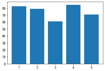
width – 棒の幅を設定する
width で棒の幅を設定します。
- float: すべて同じ幅に設定します
- array of float: それぞれ異なる幅に設定します
In [2]:
x = np.arange(1, 6)
y = np.array([83, 79, 61, 85, 71])

fig, [ax1, ax2] = plt.subplots(1, 2, figsize=(8, 4))

# すべて 0.2 に設定する。
ax1.bar(x, y, width=0.2)
# 各棒ごとに設定する。
ax2.bar(x, y, width=[0.5, 0.2, 0.7, 0.3, 0.4])

plt.show()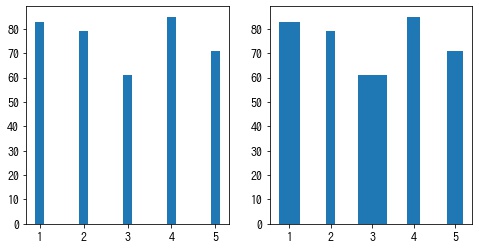
bottom – 棒の下端の y 座標を設定する
bottom で棒の下端の y 座標を設定します。積み上げ棒グラフを作成したい場合に使用します。
In [3]:
x = np.arange(1, 6)
y1 = np.array([83, 79, 61, 85, 71])
y2 = np.array([83, 95, 72, 77, 94])

fig, ax = plt.subplots()

ax.bar(x, y1)
ax.bar(x, y2, bottom=y1)

plt.show()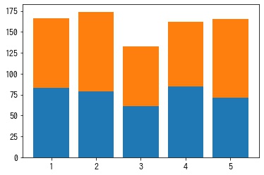
align – 棒の配置位置を設定する
align で棒の配置位置を設定します。
- “edge”: 棒の左端を
xに合わせて配置する - “center”: 棒の中心を
xに合わせて配置する
In [4]:
import matplotlib.pyplot as plt
import numpy as np

x = np.arange(1, 6)
y = np.random.randint(50, 100, 5)

# 棒グラフを作成する。
fig, [axes1, axes2] = plt.subplots(1, 2, figsize=(8, 4))
axes1.bar(x, y, align="center", width=0.5)  # x の値に棒の中央がくるように配置
axes2.bar(x, y, align="edge", width=0.5)  # x の値に棒の左端がくるように配置

plt.show()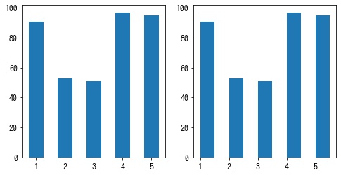
color – 棒の色を設定する
In [5]:
x = np.arange(1, 6)
y = np.array([83, 79, 61, 85, 71])

# 棒グラフを作成する。
fig, [ax1, ax2] = plt.subplots(1, 2, figsize=(8, 4))

# すべて green に設定する。
ax1.bar(x, y, color="green", width=0.5)

# 各棒ごとに設定する。
ax2.bar(x, y, color=["red", "blue", "green", "pink", "orange"], width=0.5)

plt.show()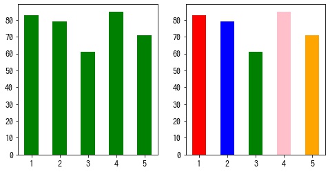
edgecolor – 棒の枠線の色を設定する
In [6]:
x = np.arange(1, 6)
y = np.array([83, 79, 61, 85, 71])

# 棒グラフを作成する。
fig, [ax1, ax2] = plt.subplots(1, 2, figsize=(8, 4))

# すべて green に設定する。
ax1.bar(x, y, edgecolor="k", width=0.5)

# 各棒ごとに設定する。
ax2.bar(x, y, edgecolor=["red", "blue", "green", "pink", "orange"], width=0.5)

plt.show()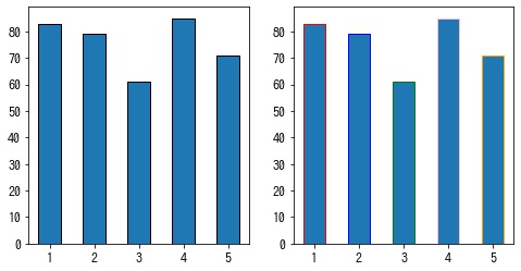
edgecolor – 棒の枠線の幅を設定する
In [7]:
x = np.arange(1, 6)
y = np.array([83, 79, 61, 85, 71])

fig, [ax1, ax2, ax3] = plt.subplots(1, 3, figsize=(8, 3))

# 枠線なし
ax1.bar(x, y, edgecolor="red", linewidth=0)

# すべて 2 に設定する。
ax2.bar(x, y, edgecolor="red", linewidth=2)

# 各棒ごとに設定する。
ax3.bar(x, y, edgecolor="red", linewidth=[1, 3, 0, 2, 4])

plt.show()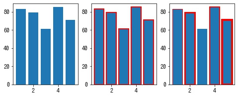
tick_label – 棒のラベルを設定する
In [8]:
x = np.arange(1, 6)
y = np.array([83, 79, 61, 85, 71])

fig, [ax1, ax2] = plt.subplots(1, 2, figsize=(8, 4))

# すべて 'label' に設定する。
ax1.bar(x, y, tick_label="label")

# 各棒ごとに設定する。
ax2.bar(x, y, tick_label=["label1", "label2", "label3", "label4", "label5"])

plt.show()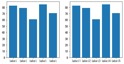
In [9]:
## log - y 軸を対数スケールに設定する
In [10]:
x = np.arange(1, 6)
y = np.array([83, 79, 61, 85, 71])

fig, ax = plt.subplots()

# y 軸を対数スケールに設定する。
ax.bar(x, y, log=True)

plt.show()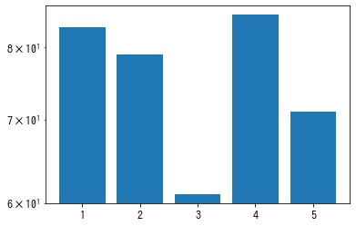
plt.barh – 横向きの棒グラフを作成する
横向きの棒グラフは matplotlib.pyplot.barh で作成できます。
In [11]:
import matplotlib.pyplot as plt
import numpy as np

x = np.arange(1, 6)
y = np.array([83, 79, 61, 85, 71])

fig, axes = plt.subplots()
axes.barh(x, y)

plt.show()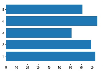
plt.broken_barh – 水平方向に連続した長方形を作成する
xrange=[(x, width), (x, width), ...]と長方形の始点と幅のタプルのリストを指定しますyrange=(ymin, ymax)と長方形の垂直方法の長さを指定します
In [12]:
fig, ax = plt.subplots()

ax.broken_barh([(1, 1), (3, 1)], (1, 3), color='r')
ax.broken_barh([(5, 1)], (2, 3), color='g')
ax.broken_barh([(7, 1)], (3, 3), color='b')

plt.show()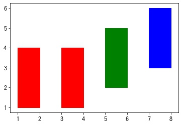
コメント