
目次
概要
matplotlib の imshow で画像やヒートマップを描画する方法を解説します。
公式リファレンス
API
- pyplot.imshow: 画像または2次元配列を表示する。
- axes.Axes.imshow: 画像または2次元配列を表示する。
- pyplot.matshow: 2次元配列を表示する。
- axes.Axes.matshow: 2次元配列を表示する。
サンプル
- Matshow: 2次元配列を表示する。
- Multi Image: 複数の画像を表示する。
- Affine transform of an image: アフィン変換を適用して、表示する。
- Barcode Demo: 1次元配列を表示する。
pyplot.imshow
matplotlib.pyplot.imshow(X, cmap=None, norm=None, aspect=None, interpolation=None, alpha=None, vmin=None, vmax=None, origin=None, extent=None, *, filternorm=True, filterrad=4.0, resample=None, url=None, data=None, **kwargs)引数
| 名前 | 型 | デフォルト値 |
|---|---|---|
| X | array-like or PIL image | |
| 画像データ | ||
| cmap | str or Colormap | rcParams[“image.cmap”] (“viridis”) |
| カラーマップオブジェクトまたは登録済みのカラーマップ名。image が RGB または RGBA データの場合は無視される。 | ||
| norm | Normalize | None |
| Normalize オブジェクト。image が RGB または RGBA データの場合は無視される。 | ||
| aspect | {‘equal’, ‘auto’} or float | rcParams[“image.aspect”] (“equal”) |
| アスペクト比 | ||
| interpolation | str | rcParams[“image.interpolation”] (“antialiased”) |
| 補完方法 | ||
| alpha | float or array-like | None |
| アルファブレンドに使用するアルファ値 | ||
| vmin, vmax | float | |
| カラーマップで表示する値の範囲 | ||
| origin | {‘upper’, ‘lower’} | rcParams[“image.origin”] (“upper”) |
| 原点の位置 | ||
| extent | floats (left, right, bottom, top) | None |
| Axes の中で画像が配置される領域 | ||
| filternorm | bool, default: True | True |
| アンチグレイン画像リサイズフィルタのパラメータ。filternorm が設定されていると、フィルタは整数値を正規化して丸め誤差を補正します。 | ||
| filterrad | float > 0, default: 4.0 | 4.0 |
| 補間方法 ‘sinc’, ‘lanczos’ 及び ‘blackman’ で使用するフィルタの半径 | ||
| resample | bool | rcParams[“image.resample”] (True) |
| False の場合は描画領域より画像が大きい場合のみ縮小する。 | ||
| url | str | None |
| url | ||
返り値
| 名前 | 説明 |
|---|---|
| AxesImage | imshow で作成したオブジェクト |
image の指定方法
次の形状の配列に対応しています。
- (M, N): カラーマップを適用して表示する
- (M, N, 3): RGB 値として解釈して表示する
- (M, N, 4): RGBA 値として解釈して表示する
形状が (M, N, 3) または (M, N, 4) の場合、各画素は $[0, 1]$ の float 型または $[0, 255]$ の int 型である必要があります。範囲外の値はこの範囲にクリップした上で表示されます。
グレースケール画像を表示する
グレースケール画像は形状が (M, N) なので、カラーマップが適用されて描画されます。 グレースケール画像として表示したい場合は cmap="gray" を指定します。

In [1]:
import numpy as np
from matplotlib import pyplot as plt
from PIL import Image
np.random.seed(0)
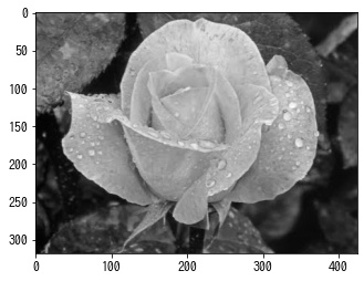
img = np.array(Image.open("sample.jpg").convert("L"))
print(img.shape)
fig, ax = plt.subplots()
ax.imshow(img, cmap="gray")
plt.show()(318, 425)
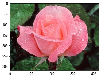
カラー画像を表示する
In [2]:
img = plt.imread("sample.jpg")
print(img.shape)

fig, ax = plt.subplots()
ax.imshow(img)

plt.show()
(318, 425, 3)

OpenCV のカラー画像
OpenCV の cv2.imread() で読み込んだ画像はチャンネルの順番が BGR なので、imshow() で表示する前に RGB に変換する必要があります。
In [3]:
import cv2

bgr = cv2.imread("sample.jpg")
rgb = cv2.cvtColor(bgr, cv2.COLOR_BGR2RGB)

fig, ax = plt.subplots()
ax.imshow(bgr)

fig, ax = plt.subplots()
ax.imshow(rgb)

plt.show()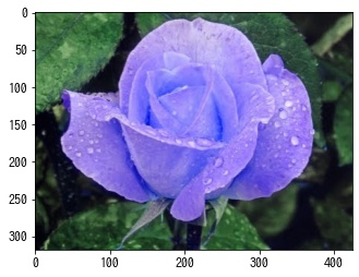
2次元配列
形状が (M, N) の配列を渡した場合は、カラーマップで描画されます。
In [4]:
mat = np.random.rand(10, 10)

fig, ax = plt.subplots()
ax.imshow(mat)

plt.show()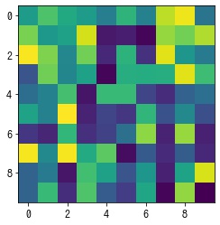
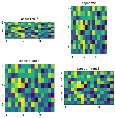
aspect – アスペクト比を設定する
aspect でアスペクト比を指定します。
- float: height / widthheight/width で指定する
- ‘auto’: Axes に合わせてアスペクト比を調整する
- ‘equal’: マス目が正方形になるようにアスペクト比を調整する
alpha – 透過度を設定する
alpha でメッシュの透過度を指定します。
In [5]:
mat = np.random.rand(10, 10)

fig, ax = plt.subplots()
ax.imshow(mat, alpha=0.5)

plt.show()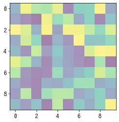
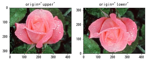
origin – 座標系を設定する
- “upper”: 左上原点で +x が右、+y が下の画像座標系
- “lower”: 左下原点で +x が右、+y が上の標準座標系
matshow – 2次元配列を表示する
plt.matshow() は、plt.imshow() のパラメータを2次元配列の描画用に以下をデフォルトとした関数です。
- origin=’upper’
- interpolation=’nearest’
- aspect=’equal’
- x 軸、y 軸の目盛りはそれぞれ左と上に配置される
- x 軸、y 軸の目盛りのラベルは整数で設定される
In [6]:
mat = np.random.rand(10, 10)

fig, ax = plt.subplots()
ax.matshow(mat)

plt.show()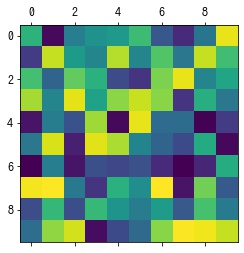
コメント