
目次
概要
matplotlib で積み上げ棒グラフを作成する方法について解説します。
積み上げ棒グラフ
項目ごとに棒グラフを積み上げて描画した棒グラフの一種です。

積み上げ縦棒グラフ
In [1]:
import numpy as np
import pandas as pd
from matplotlib import pyplot as plt


def get_data():
    data = np.array(
        [[156, 128, 285], [286, 220, 297], [218, 235, 137], [160, 298, 112]]
    )
    row_labels = ["2017", "2018", "2019", "2020"]
    col_labels = ["Android", "iOS", "Windows"]

    return pd.DataFrame(data, index=row_labels, columns=col_labels)


get_data()| Android | iOS | Windows | |
|---|---|---|---|
| 2017 | 156 | 128 | 285 |
| 2018 | 286 | 220 | 297 |
| 2019 | 218 | 235 | 137 |
| 2020 | 160 | 298 | 112 |
In [2]:
df = get_data()

n_rows, n_cols = df.shape
positions = np.arange(n_rows)
offsets = np.zeros(n_rows, dtype=df.values.dtype)
colors = plt.get_cmap("tab20c")(np.linspace(0, 1, n_cols))

fig, ax = plt.subplots()
ax.set_xticks(positions)
ax.set_xticklabels(row_labels)

for i in range(len(df.columns)):
    # 棒グラフを描画する。
    bar = ax.bar(positions, df.iloc[:, i], bottom=offsets, color=colors[i])
    offsets += df.iloc[:, i]

    # 棒グラフのラベルを描画する。
    for rect in bar:
        cx = rect.get_x() + rect.get_width() / 2
        cy = rect.get_y() + rect.get_height() / 2
        ax.text(cx, cy, df.columns[i], color="k", ha="center", va="center")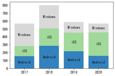
積み上げ縦棒グラフ (割合)
In [3]:
df = get_data()

# 正規化する
df = df.div(df.sum(axis=1), axis=0)

n_rows, n_cols = df.shape
positions = np.arange(n_rows)
offsets = np.zeros(n_rows, dtype=df.values.dtype)
colors = plt.get_cmap("tab20c")(np.linspace(0, 1, n_cols))

fig, ax = plt.subplots()
ax.set_xticks(positions)
ax.set_xticklabels(row_labels)

for i in range(len(df.columns)):
    # 棒グラフを描画する。
    bar = ax.bar(positions, df.iloc[:, i], bottom=offsets, color=colors[i])
    offsets += df.iloc[:, i]

    # 棒グラフのラベルを描画する。
    for rect in bar:
        cx = rect.get_x() + rect.get_width() / 2
        cy = rect.get_y() + rect.get_height() / 2
        ax.text(cx, cy, df.columns[i], color="k", ha="center", va="center")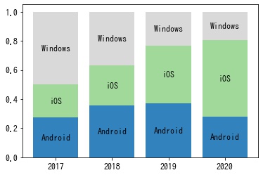
積み上げ横棒グラフ
In [4]:
df = get_data()

n_rows, n_cols = df.shape
positions = np.arange(n_rows)
offsets = np.zeros(n_rows, dtype=df.values.dtype)
colors = plt.get_cmap("tab20c")(np.linspace(0, 1, n_cols))

fig, ax = plt.subplots()
ax.set_yticks(positions)
ax.set_yticklabels(df.index)

for i in range(len(df.columns)):
    # 棒グラフを描画する。
    bar = ax.barh(positions, df.iloc[:, i], left=offsets, color=colors[i])
    offsets += df.iloc[:, i]

    # 棒グラフのラベルを描画する。
    for rect in bar:
        cx = rect.get_x() + rect.get_width() / 2
        cy = rect.get_y() + rect.get_height() / 2
        ax.text(cx, cy, df.columns[i], color="k", ha="center", va="center")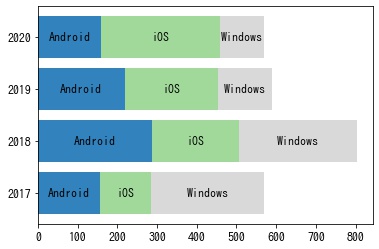
積み上げ横棒グラフ (割合)
In [5]:
df = get_data()

# 正規化する
df = df.div(df.sum(axis=1), axis=0)

n_rows, n_cols = df.shape
positions = np.arange(n_rows)
offsets = np.zeros(n_rows, dtype=df.values.dtype)
colors = plt.get_cmap("tab20c")(np.linspace(0, 1, n_cols))

fig, ax = plt.subplots()
ax.set_yticks(positions)
ax.set_yticklabels(df.index)

for i in range(len(df.columns)):
    # 棒グラフを描画する。
    bar = ax.barh(positions, df.iloc[:, i], left=offsets, color=colors[i])
    offsets += df.iloc[:, i]

    # 棒グラフのラベルを描画する。
    for rect in bar:
        cx = rect.get_x() + rect.get_width() / 2
        cy = rect.get_y() + rect.get_height() / 2
        ax.text(cx, cy, df.columns[i], color="k", ha="center", va="center")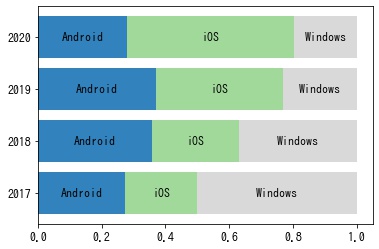
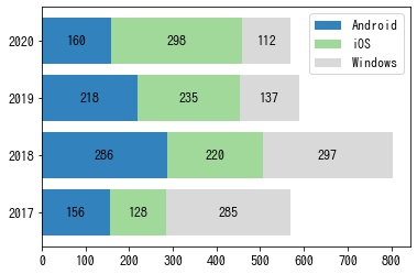
数値を表示する (値)
In [6]:
df = get_data()

n_rows, n_cols = df.shape
positions = np.arange(n_rows)
offsets = np.zeros(n_rows, dtype=df.values.dtype)
colors = plt.get_cmap("tab20c")(np.linspace(0, 1, n_cols))

fig, ax = plt.subplots()
ax.set_yticks(positions)
ax.set_yticklabels(df.index)

for i in range(len(df.columns)):
    # 棒グラフを描画する。
    bar = ax.barh(
        positions, df.iloc[:, i], left=offsets, color=colors[i], label=df.columns[i]
    )
    offsets += df.iloc[:, i]

    # 棒グラフのラベルを描画する。
    for rect, value in zip(bar, df.iloc[:, i]):
        cx = rect.get_x() + rect.get_width() / 2
        cy = rect.get_y() + rect.get_height() / 2
        ax.text(cx, cy, value, color="k", ha="center", va="center")

ax.legend(bbox_to_anchor=(1, 1))
<matplotlib.legend.Legend at 0x7f7c1b3c9070>
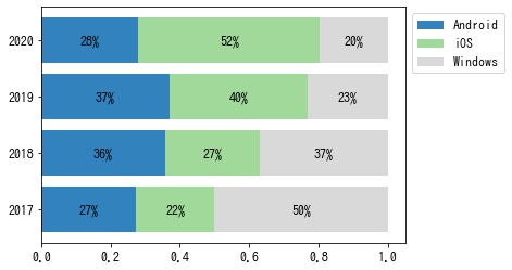
数値を表示する (パーセント)
In [7]:
df = get_data()

# 正規化する
df = df.div(df.sum(axis=1), axis=0)

n_rows, n_cols = df.shape
positions = np.arange(n_rows)
offsets = np.zeros(n_rows, dtype=df.values.dtype)
colors = plt.get_cmap("tab20c")(np.linspace(0, 1, n_cols))

fig, ax = plt.subplots()
ax.set_yticks(positions)
ax.set_yticklabels(df.index)

for i in range(len(df.columns)):
    # 棒グラフを描画する。
    bar = ax.barh(
        positions, df.iloc[:, i], left=offsets, color=colors[i], label=df.columns[i]
    )
    offsets += df.iloc[:, i]

    # 棒グラフのラベルを描画する。
    for rect, value in zip(bar, df.iloc[:, i]):
        cx = rect.get_x() + rect.get_width() / 2
        cy = rect.get_y() + rect.get_height() / 2
        ax.text(cx, cy, f"{value:.0%}", color="k", ha="center", va="center")

ax.legend(bbox_to_anchor=(1, 1))
<matplotlib.legend.Legend at 0x7f7c238cdf70>
コメント